
Visualizing Financial Data with DuckDB And Plotly
I like to keep a pretty close eye on my finances, such as my spending habits and net worth. Over the years, I’ve used a lot of different tools, such as YNAB, Mint and Quicken.
These days, I really like the spreadsheet based tool Tiller (note: affiliate link). With Tiller, all of my financial data lives in a spreadsheet that I control (in Google Sheets).
The visualizations that come with Tiller are incredible (both official and community), but a huge benefit is having all of my data available as a spreadsheet. I can export the data as CSVs and then run whatever tools I want.
I also recently learned about Plotly, a great graphing library for Python. Combine that with my love of DuckDB for querying data1, and I have found new ways to visualize my financial data.
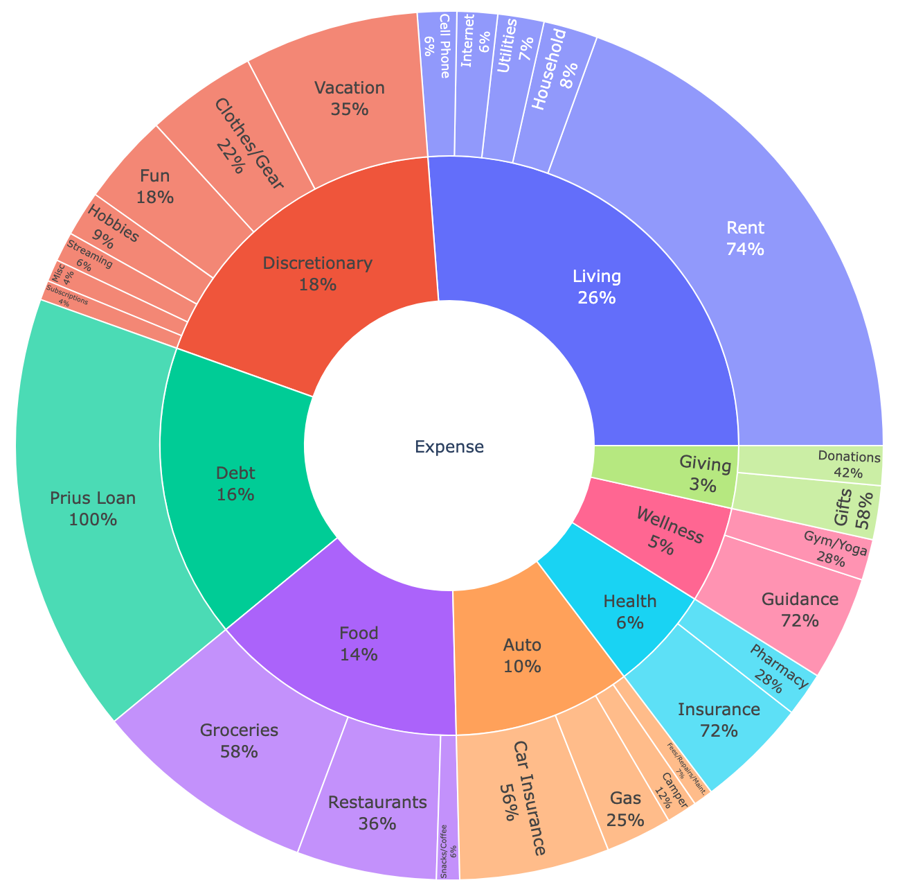
For example, below is a sunburst diagram visualizing expenses. An interactive version is available at plotly_expenses.html.
(For these examples, I’m using this sample Tiller sheet from this community post.)
In the sections below, I’ll walk through how I generated this diagram.
Querying Tiller Data with DuckDB
First, I exported the Transactions and Categories tabs from the Tiller Sheet. Transactions is a list of every ingested transaction with an assigned category. The Categories tab adds a hierarchy to the set of categories, such as Groceries and Restaurants belonging to the Food group of expenses.
Then, I used DuckDB to query these sheets in Python. For example, here’s a sum of expenses by group and category:
expenses_by_category = duckdb.sql(
    """
    select
        c.Type,
        c.Group,
        t.Category,
        -round(sum(replace(replace(t.Amount, '$', ''), ',', '')::decimal), 1) as Amount
    from read_csv('Tiller Sample Data - Transactions.csv') t
    join read_csv('Tiller Sample Data - Categories.csv') c on c.Category = t.Category
    and c."Hide From Reports" is null
    and c.Type = 'Expense'
    group by t.Category, c.Group, C.Type
"""
)

expenses_by_category.show()
Which prints:
┌─────────┬───────────────┬─────────────────────┬───────────────┐
│  Type   │     Group     │      Category       │    Amount     │
│ varchar │    varchar    │       varchar       │ decimal(38,1) │
├─────────┼───────────────┼─────────────────────┼───────────────┤
│ Expense │ Discretionary │ Clothes/Gear        │        8612.5 │
│ Expense │ Wellness      │ Guidance            │        8131.8 │
│ Expense │ Food          │ Snacks/Coffee       │        1796.6 │
│ Expense │ Auto          │ Camper              │        2392.8 │
│ Expense │ Discretionary │ Subscriptions       │        1540.0 │
│ Expense │ Food          │ Groceries           │       17483.5 │
│ Expense │ Living        │ Household           │        4231.0 │
│ Expense │ Health        │ Pharmacy            │        3437.9 │
│ Expense │ Discretionary │ Streaming           │        2303.0 │
│ Expense │ Wellness      │ Gym/Yoga            │        3171.9 │
│    ·    │  ·            │    ·                │           ·   │
│    ·    │  ·            │    ·                │           ·   │
│    ·    │  ·            │    ·                │           ·   │
│ Expense │ Food          │ Restaurants         │       10897.4 │
│ Expense │ Auto          │ Fees/Repairs/Maint. │        1549.1 │
│ Expense │ Discretionary │ Hobbies             │        3538.9 │
│ Expense │ Living        │ Cell Phone          │        3060.0 │
│ Expense │ Giving        │ Donations           │        3086.4 │
│ Expense │ Living        │ Utilities           │        3600.0 │
│ Expense │ Living        │ Rent                │       40727.9 │
│ Expense │ Discretionary │ Fun                 │        7076.9 │
│ Expense │ Living        │ Internet            │        3150.0 │
│ Expense │ Auto          │ Car Insurance       │       11682.0 │
├─────────┴───────────────┴─────────────────────┴───────────────┤
│ 26 rows (20 shown)                                  4 columns │
└───────────────────────────────────────────────────────────────┘
The only tricky part was cleaning up the Amount field so DuckDB treated it as a number. There may be a simpler way to do that.
Graphing with Plotly
Once I had the tabular data from DuckDB, graphing it with Plotly was simple. Plotly can generate an image file, but I think it really shines when generating standalone, interactive HTML:
expenses_by_category_sunburst = px.sunburst(
    expenses_by_category,
    path=["Type", "Group", "Category"],
    values="Amount",
)

expenses_by_category_sunburst.update_traces(textinfo="label+percent parent")

expenses_by_category_sunburst.write_image("expenses_sunburst.png")

expenses_by_category_sunburst.write_html("plotly_expenses.html")
Full script
I use uv these days for managing Python dependencies, which lets you embed the dependency requirements as a comment in the Python script. So you can save this as tiller_plotly.py and then run it with uv run tiller_plotly.py, which will automatically download the dependencies:
# /// script
# requires-python = ">=3.12"
# dependencies = [
#     "duckdb~=1.2",
#     "kaleido~=0.2", # Needed to generate images
#     "plotly[express]~=6.0",
#     "pyarrow~=19.0",
# ]
# ///

import duckdb
import plotly.express as px

expenses_by_category = duckdb.sql(
    """
    select
        c.Type,
        c.Group,
        t.Category,
        -round(sum(replace(replace(t.Amount, '$', ''), ',', '')::decimal), 1) as Amount
    from read_csv('Tiller Sample Data - Transactions.csv') t
    join read_csv('Tiller Sample Data - Categories.csv') c on c.Category = t.Category
    and c."Hide From Reports" is null
    and c.Type = 'Expense'
    group by t.Category, c.Group, C.Type
"""
)

expenses_by_category.show()

expenses_by_category_sunburst = px.sunburst(
    expenses_by_category,
    path=["Type", "Group", "Category"],
    values="Amount",
)

expenses_by_category_sunburst.update_traces(textinfo="label+percent parent")

expenses_by_category_sunburst.write_image("expenses_sunburst.png")

expenses_by_category_sunburst.write_html("plotly_expenses.html")
And if you want to try out Tiller, check it out here: Tiller (affiliate link)
-
Other DuckDB posts I’ve written: DuckDB as the New jq and DuckDB over Pandas/Polars ↩