
Flight delay information for United flights
Since I work for a consulting company, I travel for a living. As a result, I’ve taken quite an interest in flight statistics. For example, how often is my flight on time? What kind of delays can I expect? Has it gotten worse over time?
To answer these questions, I wrote a quick rails app using the publicly available data at the Bureau of Transportation Statistics. This app graphs the delay from each flight on a bar graph over time. I only loaded United flights to save space since the data can get quite large.
Check out the app here: Flight Delay Information. Just enter your flight number, the airport codes, and the day of the week. It is not the prettiest site, but I find the results really interesting.
Here is an example graph of a Thursday night flight from Newark to
Chicago: 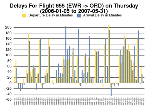
I hope to expand this app at some point with more graphs and information. If you’d like to help, please let me know.