
Flight delays application overhaul
In Flight delay information for United flights, I talked about an application I wrote to show United flight delays over time. I have now completely rewritten that application to allow comparison of multiple flights on one graph.
People that travel for a living know that early morning flights tend to be less delayed than evening flights. In the morning, the planes are usually already at the airport, so there is no chance of an incoming flight delay. There are no lines of planes waiting to take off yet, so the time between leaving the gate and getting into the air tends to be a lot less.
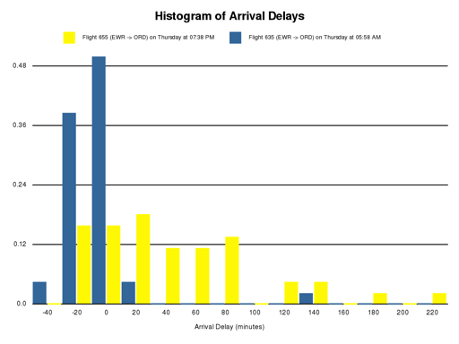
The difference in these times can be dramatic. Here is a report comparing an early morning flight with an evening flight from Newark to Chicago (two heavily delayed airports): Flight Delays
The report shows a table of min, max, and median delays:
Flight Min Delay Median Delay Max Delay —————————————————————————— ———– ————– ———– Flight 655 (EWR -> ORD) on Thursday at 07:38 PM -14 40 239 Flight 635 (EWR -> ORD) on Thursday at 05:58 AM -26 0 157
And here are the two graphs shown in the report above:
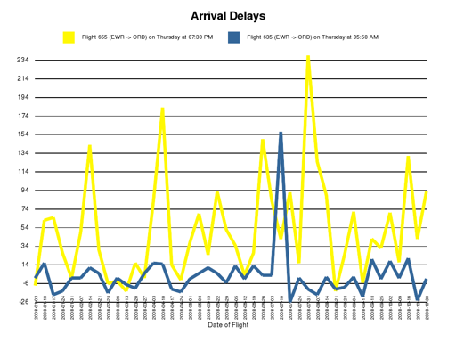
As you can see from the first graph, day by day, flight 655 (departing around 7:38 PM) is almost always more delayed than flight 635 (departing around 5:58 AM).
The second graph shows a histogram. You can see that flight 635 is clustered more heavily to the left (-40 to 20) which shows that it is generally between 40 minutes early and 20 minutes late. Flight 655 is much more spread out to the right, which shows that it has far more delays. On one day, it was over 220 minutes late!